Friday, July 24, 2015

My presentation at USGS

On Monday 7/20 my mentor invited me to visit her workplace, the USGS, where I got to meet with a team of scientists. They work at the Eastern Geographic Science Center, which is a division of the USGS dedicated to evaluating the impacts of land use and land cover changes on natural resources and environmental health. There were two Information Technology specialists and a member of the team who helped put together the Hurricane Sandy data set I have been visualizing with Tableau. I showed them the visuals that I had created, and they asked me questions about my use of color and trends in the data.

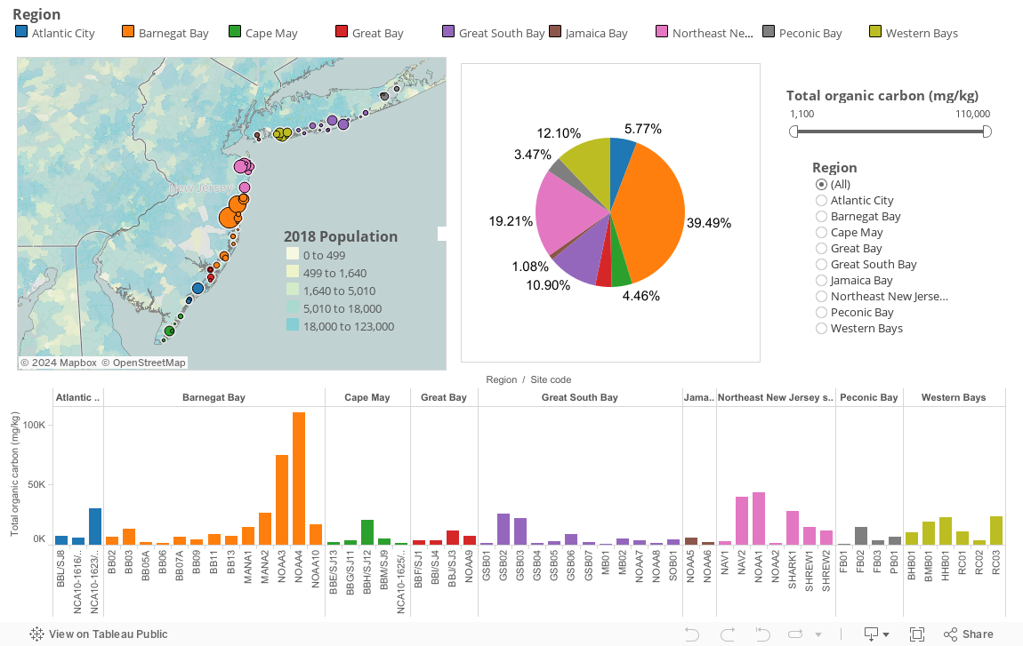
A great suggestion that they gave me is to layer some of the maps that I have created to look for correlations. This is similar to what I did for my total organic carbon dashboard, where I used a US Population map to show that areas with higher amounts of organic carbon tend to have a larger population. Another interesting thing to try would be to see how the data set about flooded businesses compares to the chemical composition of the sediment in nearby areas. This could help identify which areas are more likely to be a greater environmental concern in case of future natural disasters when businesses are destroyed and they release certain substances and chemicals into the outside environment.

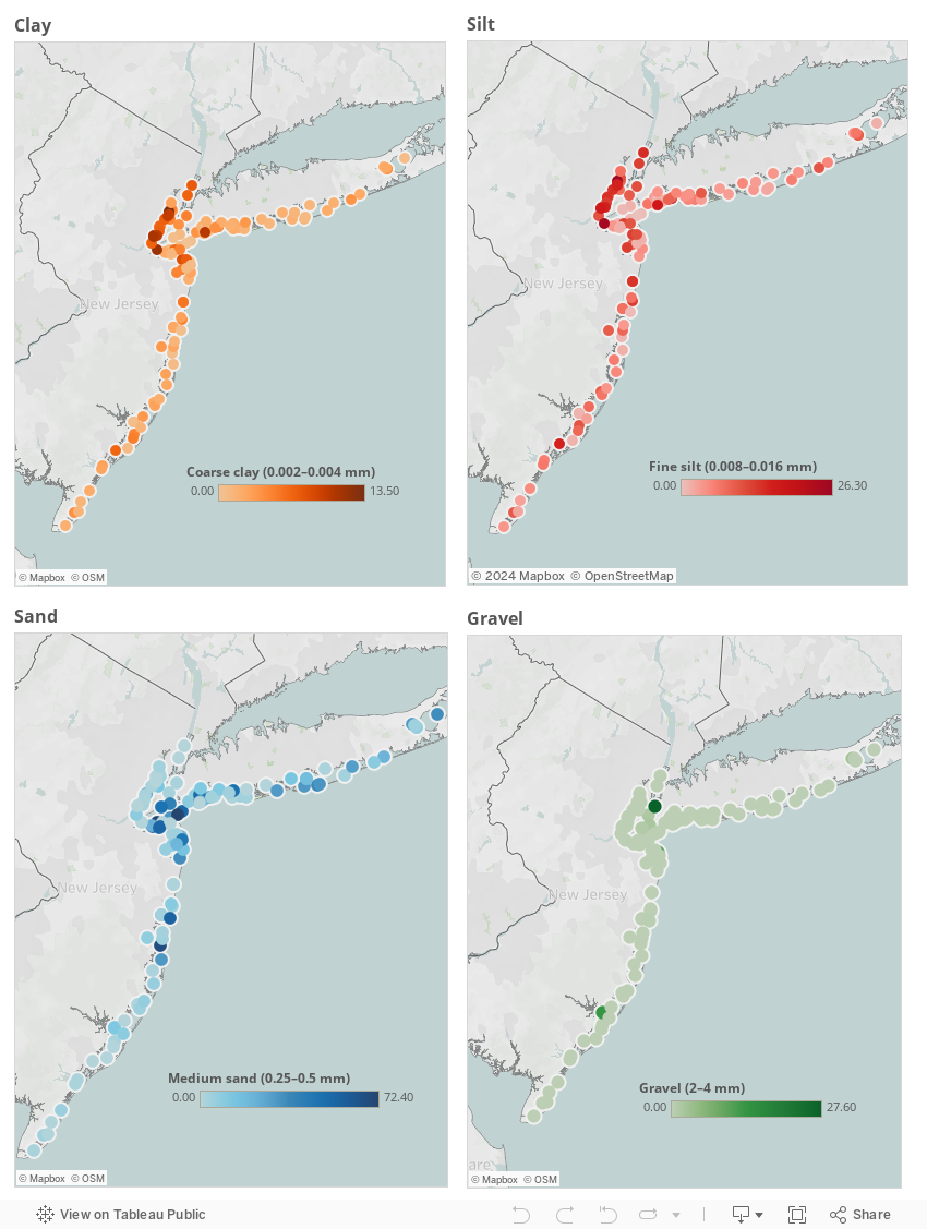
I would also like to find a way to standardize the data that I have been working with. Certain regions have greater numbers of sample sites, so when I put this on a graph it may look like an area was affected more than others when in fact it only appears that way because more data was taken from there.

I really enjoyed this opportunity to share my work with professionals in the field. I got a lot of great feedback and ideas for future projects. They also showed some interesting tools they've been trying out, such as R statistical software, which also creates cool visualizations. I'm excited to continue exploring different USGS data as well as different software.

ESRI story map

Hi! So here it is. The highlight of your day. A story map about the life cycle of critical minerals based on the report published by the USGS. All source citations are found on the last slide of the story. The view embedded here isn't the most convenient and some of the images are stretched out, but everything is there. To see the text for each slide, hit the Learn More icon. If you want to see the full, original view, here is the link: http://arcg.is/1gK3PWW

Thursday, July 16, 2015

Day 10

Today I worked on building an ESRI story map. I've been wanting to try some other types of software, so I found a USGS pdf file about the life cycle of critical minerals. I thought it would be interesting to make the information found there easier to understand by shortening the text and adding pictures, diagrams, maps, and videos. I still have some more editing to do, and I'll post a more finalized version later.

Tuesday, July 14, 2015

Day 9

Today's visualization project was focused on concentrations of organic carbon in the sediment samples collected for the Hurricane Sandy study. I created a dashboard (SEE BELOW) containing 3 different visuals:
  1. A map
    • Color-coded points representing regions
    • Size of points represents amount of organic carbon (in mg/kg) per sample site
    • Data layer- US population (2014) by zip code: the darker the blue color, the more highly populated the area is. I think it's interesting that areas with higher numbers of organic carbon (such as Barnegat Bay and Northeast New Jersey shore) also happen to be more populated. 
    • Tooltip (the box that appears when your hover your mouse over a part of a graph/map) includes the region name, sample site code, and total organic carbon for the sample site
  2. A bar chart
    • Regions labelled and color-coded
    • Divided up into sample sites
    • Length of each bar represents the total amount of organic carbon at each sample site
    • Tooltip includes the region name, sample site code, and total organic carbon for the sample site
  3.  A pie chart
    • Color-coded by region
    • Percentage of total organic carbon concentration labelled for each region
    • Exact amount of organic carbon for the whole region found in the tooltip 
    • Tooltip also includes the region name and the percentage
For increased interactivity and customization, I included 2 filters:
  1. A slider bar
    • Affects the map and the bar chart
    • Lets the user choose which range of total organic carbon they would like to view. As you move the slider to the right, you can see some of the sample sites and regions disappear, leaving only those with higher amounts of carbon.
  2. An options menu
    • Affects the map and the bar chart
    • Lets the user choose which region they would like to view, isolating it to get a better sense of its geographic location and total values. 
Here is the link if you can't see the dashboard here: https://public.tableau.com/views/CarbonEmissionsDashboard/Dashboard1?:embed=y&:display_count=yes&:showTabs=y

Monday, July 13, 2015

Day 8

Today I created some more visuals with Tableau and Hurricane Sandy data from the USGS SCoRR project (http://health.usgs.gov/scorr/). I'm going to focus more on the sediment analysis aspect, and I've begun creating maps for the data tables I believed conveyed the most useful information and that could be visualized the best. The maps that I made today focused on particle size analysis for clay, silt, sand, and gravel. I made a map for each substance, with the sample sites labelled. However, I chose not to use color for the regions, but rather for the relative concentrations of a particular sub-category. Each substance is divided into 4 or 5 subcategories. For example, sand is divided into very fine, fine, medium, and coarse sand. I tried each of them for the color variable, and medium sand provided the most interesting map. There's a color key showing how the darker the blue color, the higher the concentration of medium sized sand grains in a particular region. I created the other maps much of the same way, but I found different patterns for differently sized particles.
I put all my maps together on a dashboard, as seen below.

Friday, July 10, 2015

Day 7 and Robot Building

Today I explored some ESRI story maps and USGS minerals databases. I've done some planning for how I want to visualize the data and what stories I can tell. I'll be doing some more over the weekend, so I'll include more details in future blog posts. ;)

I also devoted several hours today to doing a side project, where I built a robot with some friends and instruction videos on Khan Academy. It was quite the experience! The videos make it seem so simple, but in truth, the process was quite complicated for someone who has never really done something like this before. The most challenging aspects were probably keeping track of what each wire does, what it is attached to, and what other wires it's not allowed to touch. It also took me some time to get the hang of working with the soldering iron. It's similar to working with a hot glue gun, except instead of plastic you're using melted metal to attach metal pieces together. You have to keep your hands really steady and make sure to have a fan blowing to dissipate the foul-smelling smoke coming off the iron.

Although it was a challenge to put together, the robot itself is quite simple. It runs on two motors attached to either side of it, and the robot works without computer code, so its abilities are fairly limited. It can move forward, and has two antennae that activate a lever when pushed down, causing the robot to turn or move backwards if it bumps into a wall, for example. It also has LED lights that you can turn on with a switch. After putting the final touches on our robot, my team and I tested it out in an obstacle course made out of a cardboard box. Much to our dismay, the antennae would only work about 30% of the time, so often the robot would get stuck next to walls or corners. Hopefully I'll be able to figure out ways to improve its functionality. Overall I had a lot of fun working on this mini project and I can't wait to do more with robots in the future!

Thursday, July 9, 2015

Day 6

Today I created another dashboard. I attempted to embed it into this blog post, but I built it in a format that was too wide, so I couldn't get it to work without messing up the view. However, for the future I hope to figure out a way for anyone to be able to interact with my visuals right from my blog page, without having to go to the Tableau website.
Here's the link for my newest project:
https://public.tableau.com/views/sewerDashboard/Dashboard2?:embed=y&:display_count=yes&:showTabs=y

And this is a screenshot of it:
For this dashboard I was working with a data table about the number of flooded combined sewer outfalls (CSOs) and sewage-treatment plants (STPs) versus the number that were not flooded as a result of Hurricane Sandy. The map in the top left is colored by region. The relative size of each bubble-point is determined by the total number of flooded sewer facilities at each sample site. The bar chart focuses on the regions as a whole rather than each sample site. Each region has its own mini bar chart, with the length of the red bar representing the number of flooded combined sewer outfalls, the green being the number of combined sewer outfalls that were not flooded, and the orange is the number of flooded sewage-treatment plants. Interestingly, there was only one flooded sewage-treatment plant at one sample site. The pie charts on the bottom left give insight into how the amount of damage per sample site in each region contributes to the total amount of flooded CSOs and STPs. If you hover over each slice of pie, the percentage of the total appears in the tooltip. The pie chart on the right is similar, but focuses more on how the overall regions relate to each other.

I also got the chance to attend Code for NOVA tonight, and there I met with my mentor to discuss my work and plan future projects. As much as I've enjoyed working with Tableau Public and Hurricane Sandy data, I plan to expand my horizons and try some new data sets (next up, rare earth elements!), as well as software (CartoDB and ESRI story maps).