Today's visualization project was focused on concentrations of organic carbon in the sediment samples collected for the Hurricane Sandy study. I created a dashboard (SEE BELOW) containing 3 different visuals:
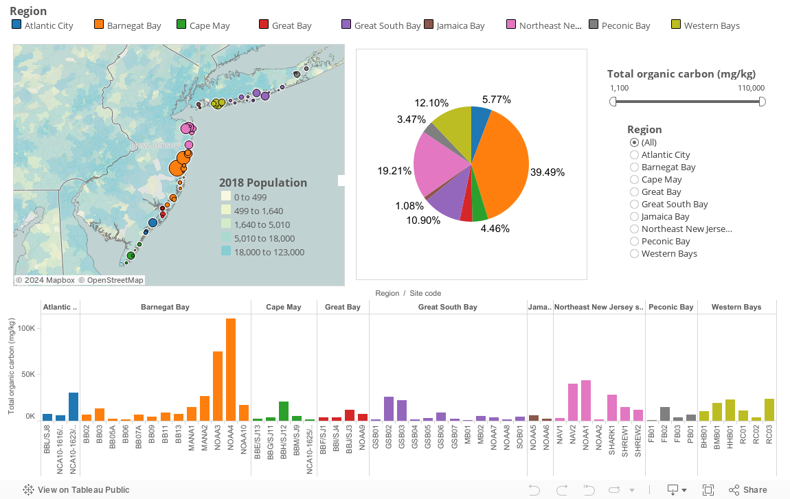
- A map
- Color-coded points representing regions
- Size of points represents amount of organic carbon (in mg/kg) per sample site
- Data layer- US population (2014) by zip code: the darker the blue color, the more highly populated the area is. I think it's interesting that areas with higher numbers of organic carbon (such as Barnegat Bay and Northeast New Jersey shore) also happen to be more populated.
- Tooltip (the box that appears when your hover your mouse over a part of a graph/map) includes the region name, sample site code, and total organic carbon for the sample site
- A bar chart
- Regions labelled and color-coded
- Divided up into sample sites
- Length of each bar represents the total amount of organic carbon at each sample site
- Tooltip includes the region name, sample site code, and total organic carbon for the sample site
- A pie chart
- Color-coded by region
- Percentage of total organic carbon concentration labelled for each region
- Exact amount of organic carbon for the whole region found in the tooltip
- Tooltip also includes the region name and the percentage
- A slider bar
- Affects the map and the bar chart
- Lets the user choose which range of total organic carbon they would like to view. As you move the slider to the right, you can see some of the sample sites and regions disappear, leaving only those with higher amounts of carbon.
- An options menu
- Affects the map and the bar chart
- Lets the user choose which region they would like to view, isolating it to get a better sense of its geographic location and total values.
That slider is really cool!
ReplyDeleteThank you!
DeleteNice job in creating a more advanced dashboard and set of visualizations. You have explored the Tableau tool very well and have given us a good understanding of its capabilities. You also did a great job in explaining each visualization. I hope you can share this on Slack or Hackpad in my USGS projects.
ReplyDeleteAlso, share what your experience has been in using Tableau. Would you recommend it to people? How easy or hard is it to get started?
Okay I'll be sure to share my visualizations on Slack and Hackpad. I'll also make a post about Tableau.
Delete