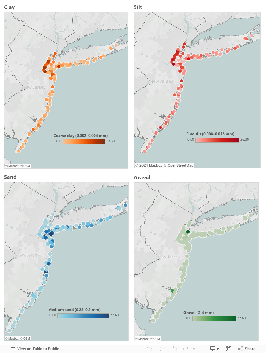
Today I created some more visuals with Tableau and Hurricane Sandy data from the USGS SCoRR project (http://health.usgs.gov/scorr/). I'm going to focus more on the sediment analysis aspect, and I've begun creating maps for the data tables I believed conveyed the most useful information and that could be visualized the best. The maps that I made today focused on particle size analysis for clay, silt, sand, and gravel. I made a map for each substance, with the sample sites labelled. However, I chose not to use color for the regions, but rather for the relative concentrations of a particular sub-category. Each substance is divided into 4 or 5 subcategories. For example, sand is divided into very fine, fine, medium, and coarse sand. I tried each of them for the color variable, and medium sand provided the most interesting map. There's a color key showing how the darker the blue color, the higher the concentration of medium sized sand grains in a particular region. I created the other maps much of the same way, but I found different patterns for differently sized particles.
I put all my maps together on a dashboard, as seen below.
I put all my maps together on a dashboard, as seen below.
Excellent maps, Sasha! Using increasing saturation of color to indicate an increase of value is very effective, and makes each of the maps visually clear and thus interesting to view.
ReplyDeleteThank you, I'm glad my use of color was effective. :)
DeleteThis is definitely a better use of color on these maps and can help to show trends and outliers. Nice job in exploring different ways to visualize and organize the interactive graphs into a dashboard.
ReplyDeleteYes color can certainly be very useful to show patterns. I've been exploring how to use it more effectively. I also figured I would try a different type of dashboard.
Delete